
{ } Club MAPFRE design system - Design tokens
Customer: MAPFRE
Goal: Standardize and scale the design system by implementing design tokens and apply them to the components.
Goal: Standardize and scale the design system by implementing design tokens and apply them to the components.
Tasks performed:
To carry out the tokenization of the color styles in the Club MAPFRE design system using Figma’s native variables, enabling better organization, reusability, and maintainability across platforms.
Each token was defined with a clear scope, making it easier to interpret for both designers and developers. The corresponding code syntax was also documented to support development integration.
In a later phase of the project, we explored the implementation of a dark mode using Figma’s color modes, laying the groundwork for future visual theming.
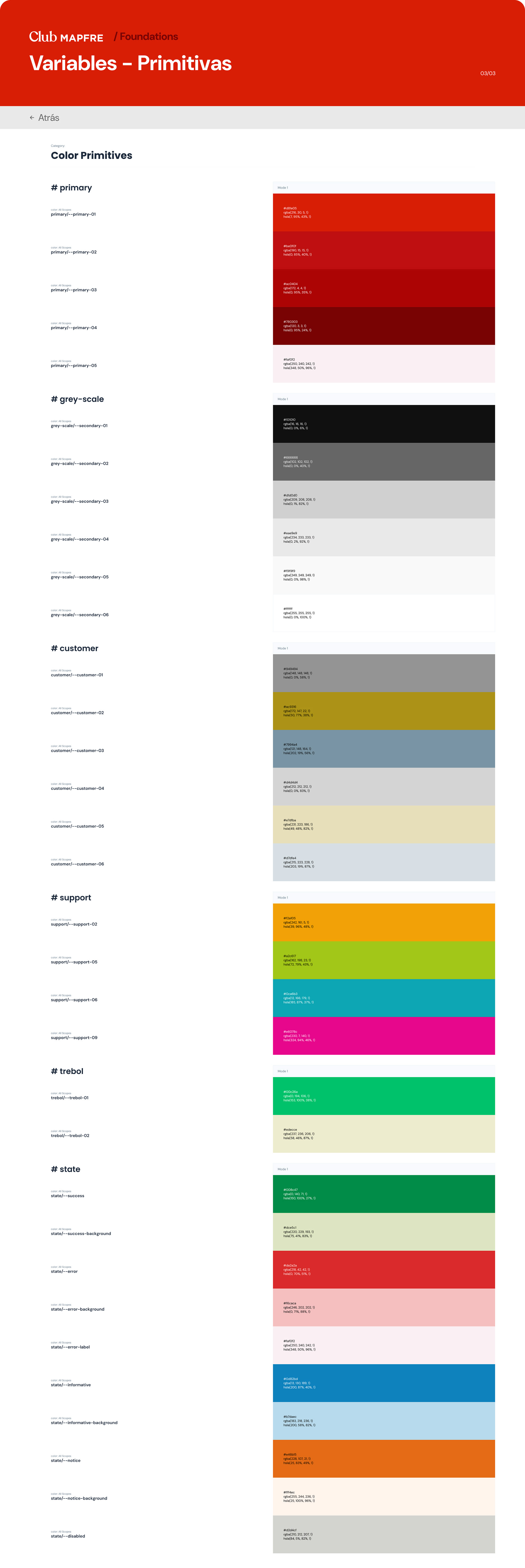
🔺 Primitives: To build a balanced and scalable token system, we first established a set of primitive variables (base colors), which were then aliased into semantic tokens based on their specific use cases in the UI. This approach allowed for flexibility and adaptability, especially when considering future themes or branding updates.
primitives - trebol
primitives - support
primitives - state
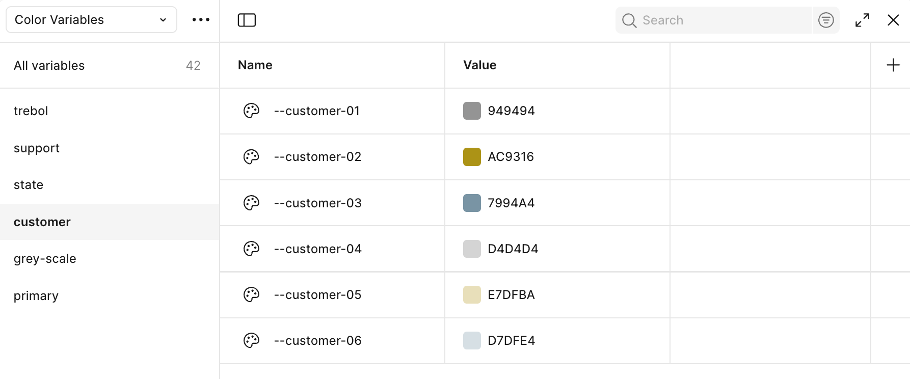
primitives - customer
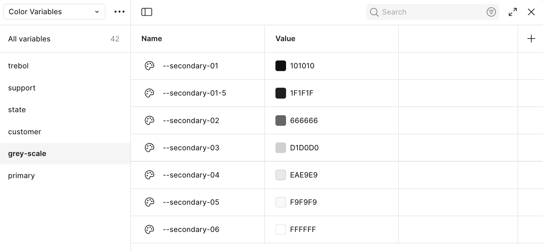
primitives - grey scale

primitives - primary
🔹 Color design tokens:
The tokenization process was based on the functional role of each color, grouping them into clear categories such as text, background, border, fill, and icon. This classification ensured a consistent and meaningful use of color throughout the system.
Each token was defined with a clear scope, following a naming convention that facilitated collaboration across design and development teams. Additionally, the code syntax for web environments was documented, enabling a smooth integration into the front-end architecture.
This structured approach not only improved maintainability and consistency but also laid the foundation for advanced features such as theme switching (e.g., light/dark mode) using Figma’s color modes.
They were finally organized applied throughout all the components of the design system via the figma plugin Styles and variables organizer, in order to accelerate this workflow.
They were finally organized applied throughout all the components of the design system via the figma plugin Styles and variables organizer, in order to accelerate this workflow.
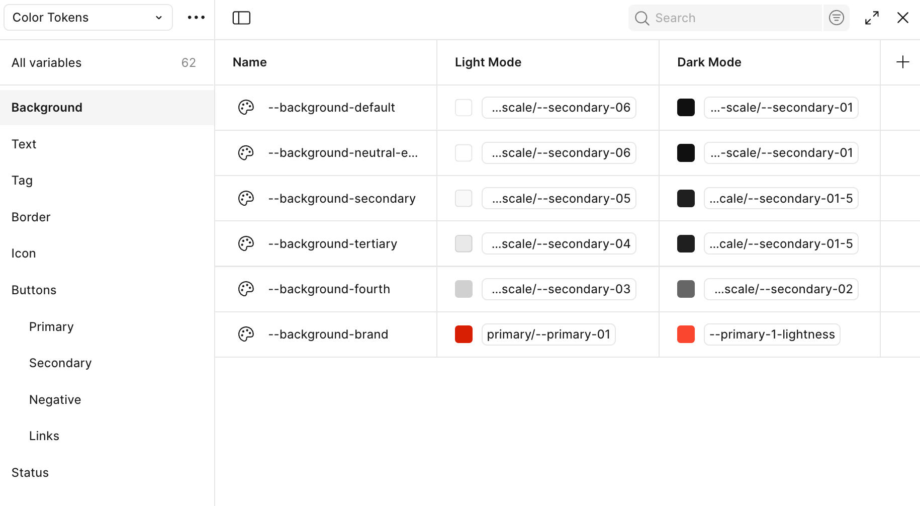
color tokens, background
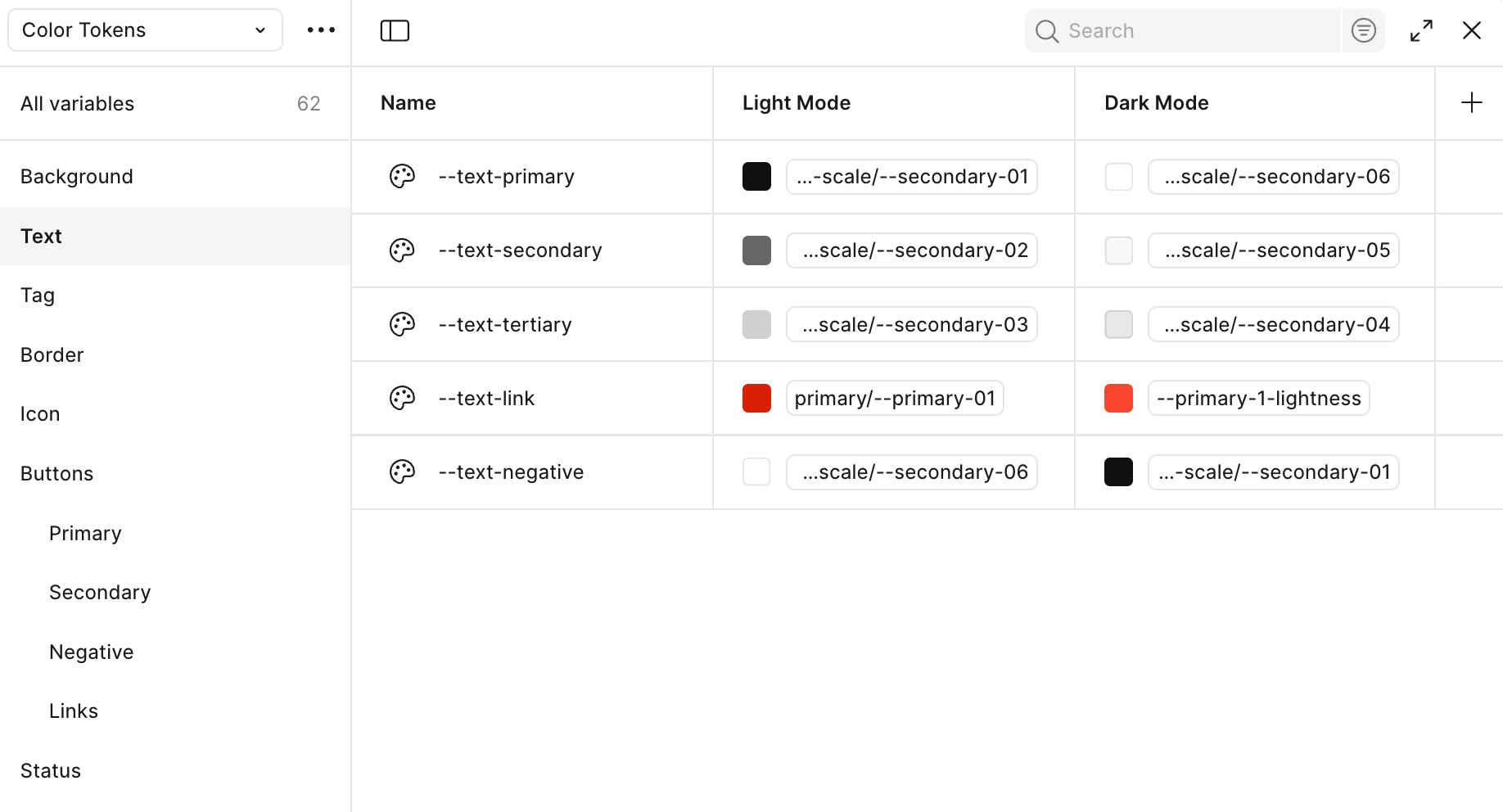
color tokens, text

color tokens, tag
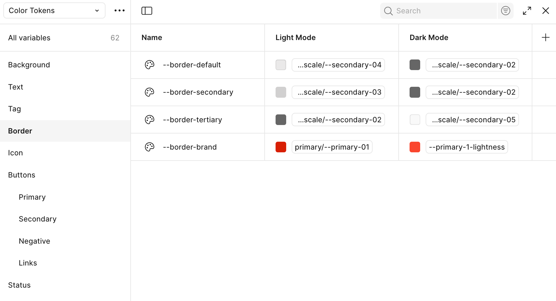
color tokens, border
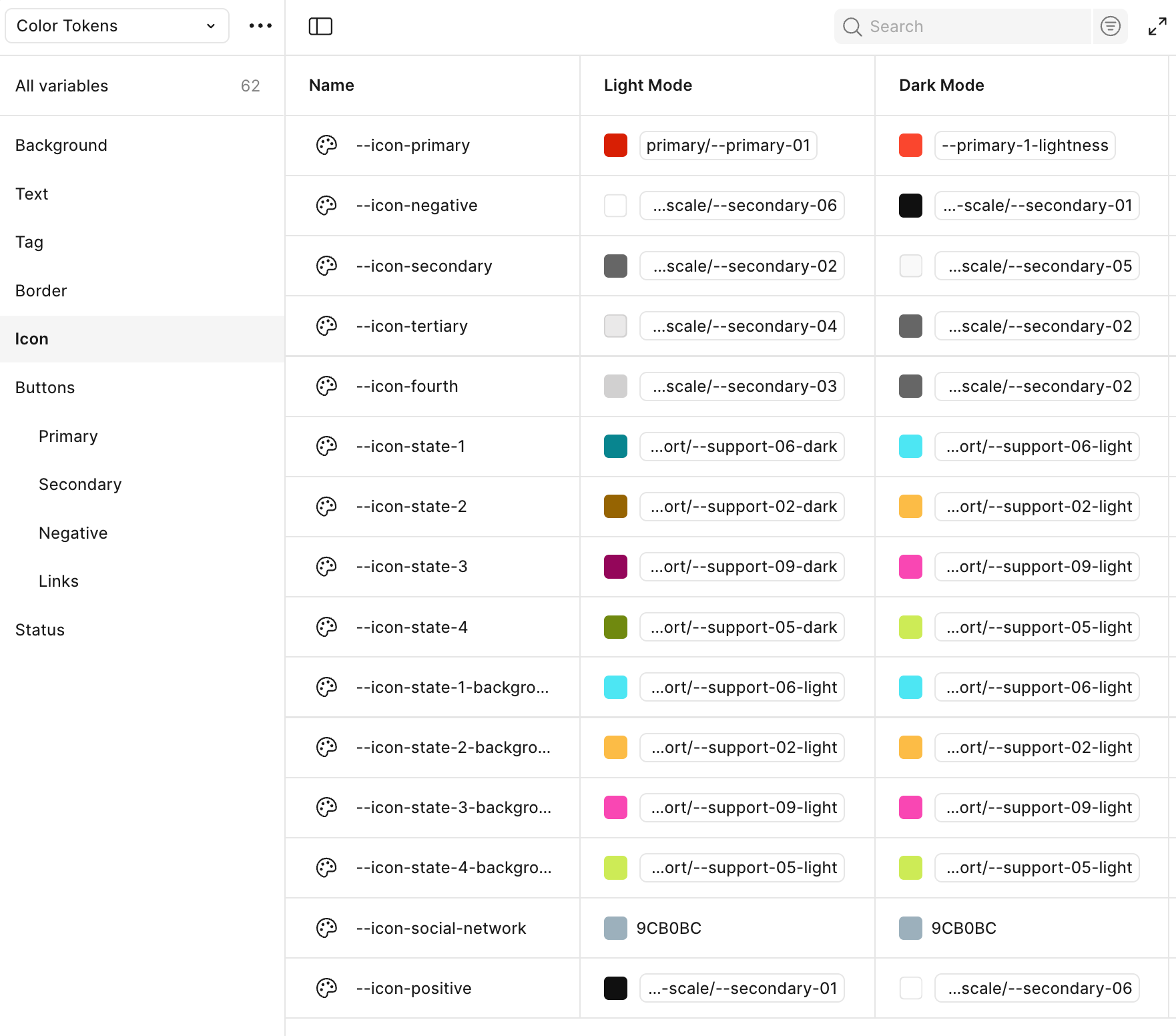
color tokens, icon
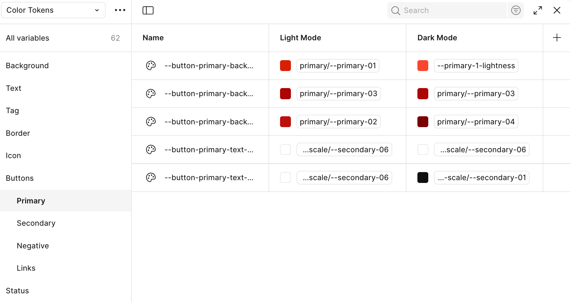
color tokens, buttons, primary
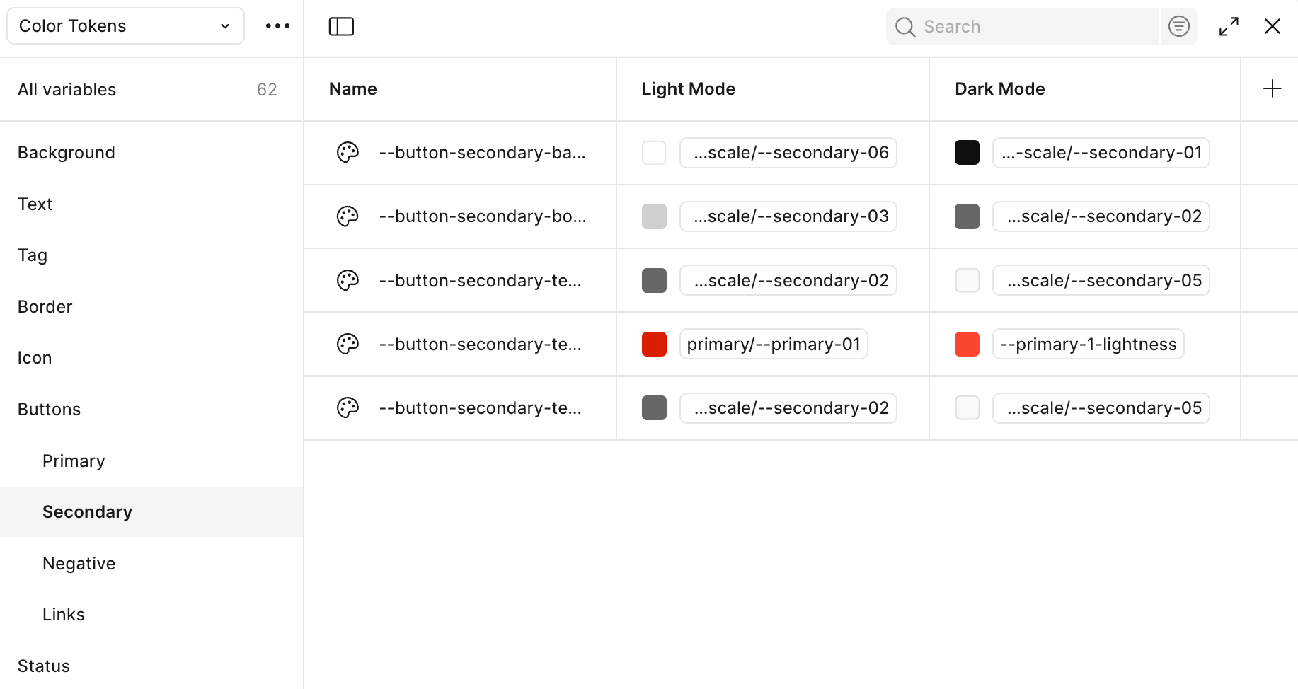
color tokens, buttons, secondary
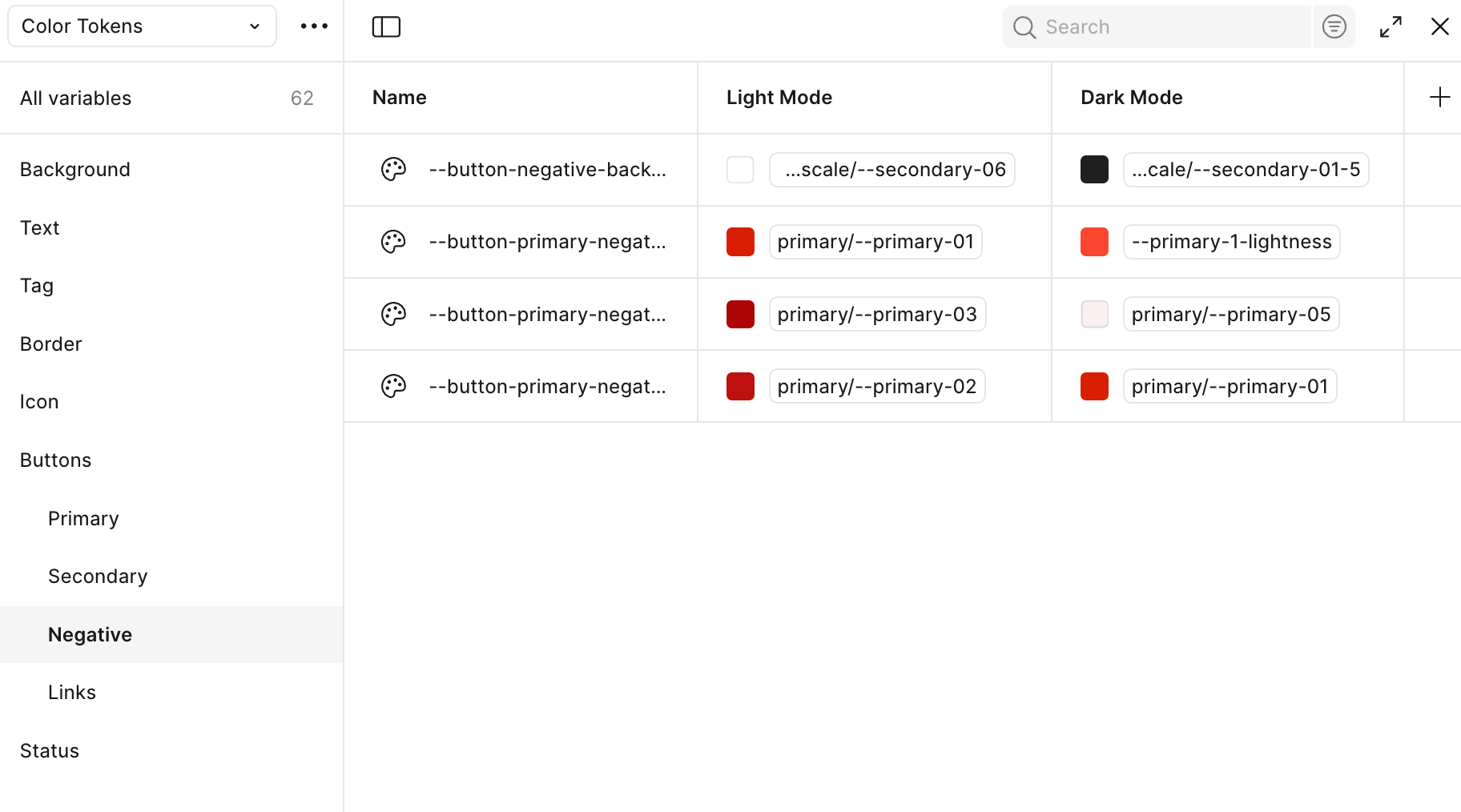
color tokens, buttons, negative
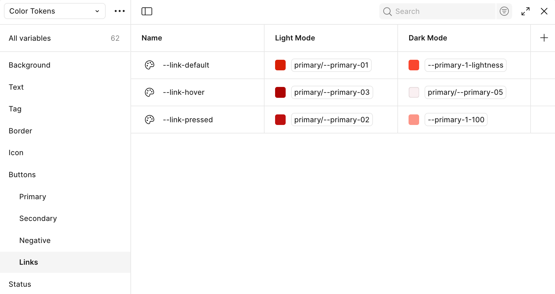
color tokens, links
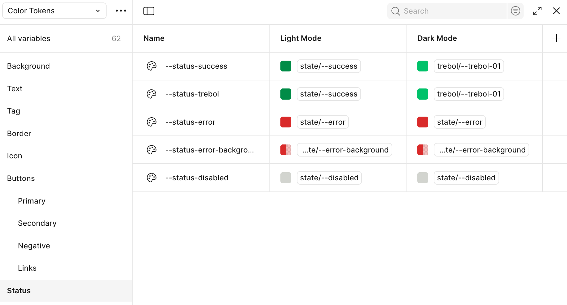
color tokens, status
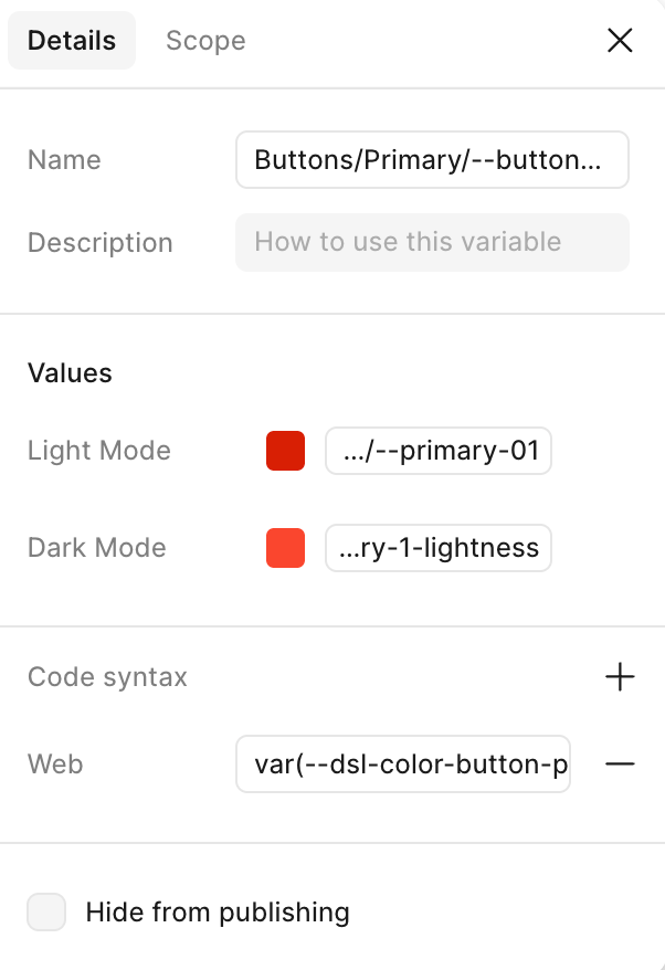
details, code syntax

Scope, fill, frame settings
Code syntax: each color token was prepared for web development using CSS custom properties. These are written with the var(--...) syntax. The structure used was var(--dsl-color-name), where dsl stands for design system layer. The rest of the token name describes its purpose, for example: --dsl-text-primary for the main text color, --dsl-bg-surface for background surfaces, or --dsl-border-divider for border lines.
This naming pattern was consistent across all tokens, making it easy for developers to understand and apply them in the code. It also allowed for better communication between design and development teams. Thanks to this system, updating a color or applying themes like dark mode became much simpler, since everything is based on centralized, meaningful variables.
Scoped token variables: In this case, the token with the name “frame” is only used for the fill color of frames. That means it’s not meant to be used for text, borders, or icons—just for filling the background of container elements or sections called frames. Defining this scope helps make sure the color is used correctly and consistently across the design system.